9.30.2010

Number Five

Dear Louis Poisson,

Those wallpaper swatches are mesmerizing. If you actually want to see a Cole & Son design firsthand, I suggest you pay a trip to Brighton’s Sejuice café (or the space that Sejuice used to occupy?). Do not waste your hard earned money on the mediocre coffee, but instead visit the ladies washroom! It’s completely plastered in flamingos! I certainly remember in that context, marveling at the wallpaper for a good five minutes and then waxing lyrical about it to a friend. Hands down – one of the best toilet experiences that I have ever had!

I guess that the nature of wallpaper has always been a bit of a design conundrum. Its well-established history within interior design has ultimately meant that the purpose of wallpaper has always been prone to modification in the hands of each designer. To turn our attention to the present day, in the case of ‘the flamingos’ by Cole & Son, a contemporary wallpaper, we can assume that when consumed, it is intended to feature as a striking and central design feature within a room. Less exciting examples of wallpaper (plain, white and flat),that you might see for sale in your average D.I.Y. store, are usually used as subtle and unobtrusive backdrops.

If we delve into the history of wallpaper however, things appear to be a little complicated. I have to admit that whilst I am no specialist in the area of wallpaper design (or even just in design…yet!), during my first term of the MA, I was treated to a really interesting one-off class about nineteenth century French wallpaper.

You questioned whether or not wallpaper could perform as something completely different to its widely accepted function of ‘blending in’ and ‘bringing out’ the detail of other things, harmoniously. In the case of the nineteenth century French wallpaper manufacturer, Dufour, wallpaper was not just a simple decorative addition to an interior that could match surrounding furnishings. Feast your eyes on this badboy.
Courtesy of V&A Collection
Courtesy  of V&A Collection
Manufactured by Dufour in 1814, these thirty lengths of wallpaper form a continuous panorama of the chief monuments of Paris, arranged along one of the banks of the Seine. Pretty impressive, right? Produced by a colour woodblock print technique, it is highly likely that this wallpaper would have served a similar purpose to today’s Cole & Son wallpapers. Aside from its eye-watering levels of intricacy and aesthetically pleasing nature however, the sample also establishes that to have acquired and used this wallpaper, ultimately meant that the user had to have had a large enough (height and width of each length of paper measures 240cm x 49.5cm) room for the entire sample to fit.

In simpler terms, rather than the size of a room determining the amount of wallpaper required, Dufour’s 'Les Monuments de Paris' determined the size of room that it could be consumed within. Authority is not in the user’s hands, but is instead within the designed object. I don’t know about you but personally, I find that somewhat mind-blowing!

Now, from 1800s French wallpaper to more contemporary wallpaper.


A new solution to blank and boring walls: concrete wallpapers! (Available at ConcreteWall).

Kind regards and sincere apologies for the delayed response,

Rei Kawakubo. 

4.28.2010

number four-cum-one

Dear Kelly Cutrone,

Well that was a poor effort on my part wasn't it? This is the thing, one needs stamina to write these days. I've been reading 'The Descent of Language' by R. Mengham (yeah, shut up, it's bloody good, I don't care), and there's an interesting part about the stigma associated with writing in traditional Western philosophy against the pedestal of speech (Plato, Aristotle, Saussure). Writing was seen as only a system of symbols for speech, and only good for recollection rather than memory, stripping language from its ability to be immediately questioned, challenged, ruminated as it was seen to be through speech. Just a theory, and cognitively balls, but imagine if, in terms of brain use, by reverting to language through typing or even just in terms of short sentences (status updates, etc), we were stripping language and our relationship with it further? (Many would say we are I'm sure, but what new results could be had that take language forward and rearrange connections in the brain...? In a good way...) Well, what I do know, which I hate and fear, is that it is sometimes a struggle for me not to speak in note form, or even think in bullet point form. How inelegant and unpoetic is that?! Anyway, enough of that. I just really like the ancient reach of the topic.

But, to art and design. I have been thinking since my MA interview about what kinds of objects I could hone in on for specialist interest, having always programmed myself towards essaying in terms of themes/trajectories rather than object domains. I know that I am interested in spaces (as you know), and dimensions, and how spaces feel/seem different according to different internal/external variations. I've been thinking about this in terms of interior design, and realised that when I look through the most excellent magazine World of Interiors, I really get a buzz when I see spaces that have used elements of mural design or trompe l'oeil. There doesn't seem to be much literature on it, so I think I might investigate that route. There's a really crazy contemporary trompe l'oeil artist called Graham Rust who's done some very large projects:

Photography by Kevin Smith

There have also been some interesting cases of topographical murals, such as those in La Galeriedes Cerfs at Fontainebleau:


Copyright: Musée et Domaine nationaux du Chateau de Fontainebleau - RMN

Every (oil on plaster) panel (by Louis Poisson c. 1600) is of a different Royal estate belonging to Henry IV - there was more on this in an issue of World of Interiors, will look this up.

Also, I've discovered the wonder of wallpapers by Cole & Son. I've picked out an enormous amount, but it's worth it, a real feast for the eyes, wallpaper-gasm...Look at these babies: (All Copyright: 2010 Cole & Son (Wallpapers) Ltd. All rights reserved.)


(All Copyright: 2010 Cole & Son (Wallpapers) Ltd. All rights reserved)

Sorry about that! Good though eh? Not really a letter-writing norm, but you could see them as a load of swatches! Is wallpaper meant to be interior decoration that blends in and brings out the detail of other things harmoniously, or does it become or function as something different when, like many of these, it catches the eye and demands attention? Especially as part of a domestic interior, these are designs to be studied and pored over.

I shall leave things there for now, as I'd like to know what you think, and what your latest interests have been.

Yours,

Louis Poisson.

12.01.2009

number three

Dear William Smith,


First and foremost, I must apologise for this huge delay in writing to you. Apparently, grad school means a huge amount of work (why wasn't I told?!!), and I've been getting to grips with my rather intensive timetable. 


It appears this week has been a good one for maps and such things cartographic. Not long ago, I paid a visit to the National Archives in Kew, in search of some much-needed stimulation for my research. I should have been pouring over musty old documents centered on the subject of personal hygiene in the eighteenth century but I couldn’t resist a quick look at the Archives extensive collection of maps. I sneaked a few cheeky glances at the sort of maps that readers were studying – and saw some beautifully aged and hand drawn numbers, that I am sure that you would have almost melted over.


Whilst I can definitely appreciate the aesthetic qualities of old maps (including the wondrous scent that they emit – they smell like history), I’m not sure if I have the attention span that maps deserve, to be properly studied and dissected. Even with contemporary maps, like the A-Z (possibly the most reliable and simple form of finding a route), I rarely look at. My London A-Z lies discarded in the boot of my car whilst my TomTom takes pride of place, right next to me attached to the inside of the windscreen. I don’t even have to look at the TomTom screen to view the map – he (off the trail here but I’ve always wondered if a machine can be gendered?) reads out the directions to me. Lovely chatty TomTom. Hmmm…maybe that’s why my map reading skills are so shoddy?


Today, I found this quite cool interactive map on Old Bailey Online however, that you might find quite interesting:


It shows an 1827 survey of London and you can cleverly locate specific place names that appeared in trials at the Old Bailey between 1674 and 1834. I quite enjoyed looking up the crime hotspots of the age and thinking about those areas in relation to the context of the present.


Off the topic of maps, I really really love that beautiful idea that you mentioned in your post – your eyesight aspiring to act as this tangible kind of letter-opener, in order to separate the elements of the sky and the sea, and finally view that intermediate space. That is really beautiful, dude. No wonder you’re a poet. It really got me thinking about eyesight en generale.


I went on another Tate Modern pilgrimage last week, this time visiting the John Baldessari show. I love Baldessari. A lot. Although his work is often reduced to being described as purely challenging the banality of art, I think his stuff is pretty good and there is a certain depth to the aesthetic of his work, which is largely ignored and not discussed. Don’t scroll down to the image just yet but perhaps my most loved Baldessari piece is Throwing four balls in the air to get a square (best of 36 tries) from 1974. A smattering of bright red balls in an expansive Californian blue sky, with a few tropical palm trees. Now scroll on further and inspect the image.


Although much of his work might have rather simplistic (or supposedly simplistic) concepts behind them, I think they are rather beautiful. There is something about these photos that appeals to my taste and makes me feel immediately cheered. I thought about possible reasons for this for quite a while. It could be down to nostalgia; I spent a lot of my childhood in California and I have fond memories of just lying on the beach and staring at that blue sky. I may only like this piece because of the title and the idea that something so folly, such as thirty-six attempts of throwing balls in the air in order to capture a square shape, has broken through that canonical seriousness of art. My love for this Baldessari work could be entirely arbitrary. I couldn’t put my finger on what was so attractive to me about this piece until I attended a truly engaging seminar, simply entitled ‘Colour.’


Let us ponder that age-old question of how one would describe colour to a blind person? How could we describe the Baldessari piece, where the majority of its composition is purely formed of that blue colour? I believe that it is that blue which fosters the aesthetic beauty of this piece, so its importance is undoubtedly imperative. How would you describe that blue to a blind person? The seminar left this question pretty much untouched and I have been unable to think of a satisfactory answer. Obviously you can relate colours to sensory experiences – yellow is acerbic like the taste of a lemon, for example. But I really struggle with trying to describe this blue in the Baldessari. It’s just stunning. And I’m not sure if I could cope, if I could never see this blue again.


Whilst the majority of art is only exclusive to the viewer with sight, I began thinking about what is out there in our world, which is only exclusive to the viewer without sight. A blind person cannot experience the colours in the Baldessari, like I can…so what can a blind person experience, that I cannot. And then I remembered this badboy:


This magnetic tray was designed by a contestant on the recent BBC show, Design for Life. If you didn’t watch it, you probably heard about it. World-renowned product designer (and a bit of a cuckoo, in my opinion), Philippe Starck, was on a mission to find a designer who could breathe some new life into the apparently stale, British product design market (Starck believes that there has not been a new national design aesthetic since Conran opened Habitat in the 1960s…hmmm). One contestant, who particularly stood out to me, was Mike Cloke. A recent University of Brighton graduate, Cloke ended up being a finalist in the Apprentice-style competition. He didn’t end up winning but I really thought he should have. With blind consumers in mind, he designed this rather impressive looking magnetic dinner tray, complete with coordinating tableware accessories. After dining in complete darkness, he understood the difficulties facing the blind, when it came to something as important as a eating a meal. Essentially, it is a relatively simple idea and lo-fi form of design, but why hadn’t there been an earlier form of this tray in the history of product design? It’s terribly surprising to see a truly new invention on the market today, especially when these inventions are being designed by talented people, of around the same age as us. Did you know that copyrights were primarily invented, not for the protection of designs, but to inspire people to invent new things?


Righto, now from high brow to Channel Five-esque low brow. I’m going to mix things up a bit and change my namesake, from the beloved Derrida. I have been indulging in some seriously bad, car-crash television recently, mostly in the form of The City – a pseudo reality show based on some Cali girl (Whitney Port) trying to make it in the hard edged fashion world in New York City. Oh god, I cannot believe I’m writing about this crap but it’s seriously addictive, almost as bad as crack. Anyway, Port works for this fashion PR company called People’s Revolution, which is headed by this woman, Kelly Cutrone:


Excuse the rather long running time, but isn’t Cutrone great?! She’s straight talking and perhaps the ultimate fashion badass. I secretly aspire to be a bit like her, down to the all black wardrobe (which I am currently cultivating), and that whole nonchalant ‘I don’t give a fuck, motherfucker’ thing. She also understands that fashion is, ultimately, a fleeting and completely arbitrary thing. Amazing stuff.


Kelly Cutrone xxxxxxx


p.s. I came across this random image whilst surfing the net for wedding-related things (I might be more obsessed with your wedding than you are!), and thought that you would appreciate this. It’s ampersand related!


p.p.s. I ordered Ingold’s ‘Lines’ and am eagerly anticipating its arrival. He has some very interesting ideas on materiality. I might invest in this baby too:


http://www.nytimes.com/2009/11/29/books/review/Schiff-t.html?_r=2


I love anything Faulkner related. 

11.17.2009

number two

Dear Jacques Derrida,

I'm afraid I may have as many questions for you as I have answers/responses/meanderings. It must be because you've started us off so well, from a place of focus and specificity, and that allows me to be a bit more all over the place. It would be interesting to think about the changes in the skill of letter-writing - it was a skill once wasn't it? 'Jane is ever so good at writing letters...'.

As an events organiser, this will be a challenge because I'm wired to immediately view things from above, and work out what goes best where -  imagine my mind as me trying to move things about like Tom Cruise in Minority Report. I'm also wired to put things into note form and (ugh) bullet points. I don't want to always think like this, it can be quite draining and can take the spontaneity out of things. So I have consciously made a decision to not do this, and will simply take joy in rambling. I have also consciously decided that I am writing this for you, a bit for myself, and don't want to worry about anyone else.

'Rambling' itself is a good word for how I want to write, since rambling, as a walker, is definitely a happy state for me.

I have been to the Musée D'Orsay once, in 2005 I think. I don't remember if there was a temporary exhibition. I do remember stumbling about, looking for paintings I recognised from our studies at Sixth Form at the time. You're right - it did feel like a train station, and that's why I like it. I like that the space is capable of doing that. But I don't think that its train station-ness is perpetuated by its inner workings of curation. I like to think it is an inbuilt expectation, a psychosomatic response to a highly specific dimension of space; surely there is a reason that my bodily memories of it are those of stumbling, jostling, snatching details, getting 'dragged along' as you said. It's its own A to B. This suggests a route, but I remember that the network of ceiling-less rooms seemed basically without direction, their only coercion was maybe to make it seem like there was a lot to be got through, creating that kind of urgency.

About the whole taking photographs in museums/galleries thing, taking out the obvious consideration that certain artefacts are sensitive to light, why are some places so relaxed while others so anal about this - can the only argument against taking photographs be copyright issues (and sensitivity to light etc), and if so, why do some places not bat an eyelid? Very confusing. I took some photographs of some Susie Cooper pieces at the V&A a couple of weeks ago, which I only did because I saw that other people were clicking away quite freely.

Back to curating and routes through space, regarding the Healey exhibition, it was important to create a very straightforward throughflow, as InQbate as a space in its entirety is not huge for retrospective exhibition purposes. BUT, you could go in either way, and both took you from theme to theme in a way that could work and that was easy and educational. We pared down his life into three 'legacies' or 'faces': his private, home life, the family man; his political, travelling, accountable life, the politician; his public, media-focused life, the personality. Each part featured things like film clips, interactive furniture, timelines, and could easily overlap, using his photographs as go-betweens. Because the exhibition was essentially about a person and his life, the route allowed you to consider him as one (everyone has different faces for different cirumstances/environments/recipients) - it didn't turn him into a group of artefacts (although I'm sure there are curators who could do that well).

I think that when things are separated, as you've described in the Art Nouveau exhibition, it is certainly regimented to make you follow a very exact route. Maybe for the purposes of making it seem 'bitesize', you take in information in divisible doses, it is to the benefit of your memory of the content, rather than your experience of the journey. I think if you are going to do it that way, especially if you are incorporating a great deal of objects, I think you should really go for it, treat the objects as objects, as evidence, as jewels, because they are being celebrated and showcased (of course the V&A rules at this). It should be clear that these are special, particularly if they are everyday objects. If they are everyday objects that have been taken out of their contexts, there's no point pretending that they are in their contexts.

As for the mixing of object formats, I am a big fan of this. And it really can work in a lot of ways according to the place that is housing things. I finally went to Pallant House Gallery in Chichester a couple of months ago, and they totally rock mixing things up as if it's the most natural thing to do in the world. They just quite simply don't have a problem with putting 15th century panels with 60s portraits (I can't remember if this combination actually occurred, but that sort of thing), in a way that some stately home might, but it's still a light and airy gallery format, well connected to its modern extension.

I think it's very difficult not to like Art Nouveau - it's definitely brought down to us as a style and not a movement, it's all about those lines and borders, and formal elements interrupting and complementing each other. I like it because when I see it I think of typography - it is simply serifs gone ecstatic, like notation. So using music seems appropriate as part of the experience. (I love this font by the way) I don't think the combination of audio with visual is revolutionary, I do think it's the way it should be, it's a gesamtkunstwerk thing, giving things a real 'feel' and texture. I remember in Christian's Germany course in the second year, there was a piece of reading that mentioned an 1890s group of artists who invited visitors into a series of room installations, complete with smells and the accompanying audible thoughts of the artists themselves (paintings finished only in the mind). It has happened, I think it just takes time and skill for curators to do it well - if it made you feel it was revolutionary, than the job must have been executed well! I think the way that this practise expands is entirely dependent on how the meanings behind the role of the curator expand (I think 'curator' still isn't in the OED).

They are the best kinds of exhibitions. Just like books, the interdisciplinary types make the best reading. I haven't read it yet, as it was a present to my Dad that I spotted and knew he'd like, but see Lines by Tim Ingold. Saw it in the Anthropology dept. of Heffers - must have been difficult to decide where to put it!

I think there is a fashion growing in curating and certain tastes in objects that could be very interesting, and could be a great way to test curator creativity. There's a lot more interest in steampunk, taxidermy, vintage clothing (of course) - things that are nostalgic and actively inhabit a sense of nostalgia. A lot of these tastes can be attributed to a friend of mine who is curatorially-minded, who dreams of cabinets of curiosity, and overloading spaces (domestic ones) with 'stuff' - why wouldn't someone be thrilled to behave as a ghost, and see everything with a sense of desire, a desire to finger things, to be closer to them, to inhabit an empathic transference of environment and 'feel'.

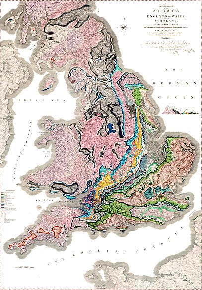
So my namesake was the first geological map-maker, whose map happened to be of Britain. He got screwed over by loads of people because he wasn't posh, and had to go to debtor's prison for a while (debtor's prison was the weirdest place - you could pretty much do what wanted, even carry on your business, it was this middle class hang out!). And of course in order to make his map, he had to walk nearly every inch of the country, most of the geology of which he was able to guess at anyway. Just finished reading Simon Winchester's The Map That Changed the World, hence inspiration. Hence, I want to get into maps and cartography.


I want to think about how people picture things from different angles, what they do and don't want to see, relating their tininess to the expanse of the landscape. Maybe it interests me in the same way that theology, science and most things that involve belief interest people - it's about the mystery of what you can't see, and for me the mystery/myth/truth is in the space inbetween, the trick of distance - it's the biggest visual headfuck I can think of. When I pop down to the sea, I always have to look at the horizon, I always want my eyesight to be this tangible kind of letter-opener, easing the sea from the sky so I can get to that inbetween.  A couple of weeks ago, on the train on the way back from Cambridge, I tried to draw a map of it starting from New Square (my mum's house, it's a Victorian Square pretty much in the centre), working round the city, trying to keep it navigable using my memory of the route of the river. Now, I've always been good at orienteering and all that, very good with a map, but when it comes to your hometown where you've never really had to use a map, only the collage of images in your head, weird things can happen - I ended up circling round on the piece of paper, coming to New Square again, much bigger, now turned on its head!!! I'd upended my internl compass completely. It made me so happy. It's like when you have dreams of your hometown, where new streets or buildings or environments start growing out of what you know, you create entirely new areas that, once you wake up, you know are supposed to be roughly in the north-east suburbs. I've only had one Brighton dream like that so far, and it definitely took vertical topography into account, it felt like a proper good walk.

Jacques, I'm spent, I'm putting my pen down, your turn. Expect I'll see you soon.

Fossils and strata,

William Smith.

11.13.2009

number one

Dear William Smith,
So…how does it feel to enter this new and exciting culture of blogging? I have to admit that I am incredibly nervous and feverish about the possibility of real and actual people reading our blog! Eeep! I am sure the water is warm however, so I’ll dive right in.        


A few weeks ago, whilst I was in Paris and when I was not stuffing my face with tarte au citron, I had the opportunity to visit the Musee D’Orsay’s current exhibition, Art Nouveau Revival. As soon as I stepped into the museum and the show itself, I immediately thought of you and how incredibly interesting you would find this place. Now, I’m not sure if you’re even a fan of the Art Nouveau style or not, but it was not the art that reminded me of your happy little face. It was the atmosphere of the institution, the layout of the exhibition and some of the remarkable methods of display that the curators of the show, had innovatively used to show a wide range of work.


Have you ever visited the Musee d’Orsay? During my visits to Paris in the past, I somehow overlooked this gem of a museum, perhaps more in favour of the Pompidou. Silly silly me. I was expecting a staid museum environment, I had visions of paintings displayed in the RA tradition (walls covered in paintings from floor to ceiling are incredibly problematic for us short-folk – neck strain hurts and once it’s there, it’s there to stay) and I thought it would be pin-drop silent. How wrong I was. The museum still felt like a train station; crowds of visitors were queuing outside to purchase tickets and once inside, it was impossible not to find yourself being dragged along by flocks of people. I overheard animated conversations in French and saw children running around statues and felt the camera flashes from the obligatory tourists taking photographs. It was lively and exciting and thriving and completely cuckoo…and I haven’t even got to the art bit yet! Jeez!


Utterly enthralled, I certainly did not expect to find nirvana so soon after my entrance, in the form of Art Nouveau Revival. Seeking to compare the style’s distinctive flourishings in the twentieth century, from its origins in the 1900s to its rediscovery in the 1930s (mostly by Dali) and then again during the sixties and seventies, the exhibition was separated into four small rooms. Every room had an individual entrance and so to progress through the show, the visitor had to exit via the entrance of each room and walk along the balcony to the next room. A fairly simple format of exhibiting, but I found it incredibly unusual. Maybe it’s down to the weekly pilgrimages I make to Tate Modern (I am obsessed with Pop Life), but I was somewhat surprised that these rooms did not have interconnecting doors or entrances. It is something that I am so accustomed to, that it felt strange and sort of constricting to have an already pre-destined route through the exhibition. How do you feel about this? Am I right in recalling that you chose to let the visitor roam freely through the space in the Healey exhibition?


Back to the d’Orsay, each room was dedicated to a specific aspect of Art Nouveau and it’s revival incorporating the style’s influence on the Surrealist group, home furnishings, psychedelic posters, and some other bits of ephemera. Personally, the exhibitions that I enjoy the most are the ones that integrate the everyday and mundane, or insert unexpected objects within a context of priceless works of art; so of course, seeing original Beardsley and Mucha illustrations aside Grateful Dead posters and Jean Paul Gaultier perfume bottles was absolutely mind-blowing! One of the earlier rooms was mostly dedicated to chairs and I swear to you Mr. Smith, I squealed when I saw a sensually curved wooden Gaudi chair paired with Allen Jones’ infamous lady coffee table.


However the best was yet to come. I cannot remember the specifics (I guess, I’m still recovering) but this is what I can recall. I entered one of the four rooms and I walked towards a glass display case. I tried to focus on what was on display, despite someone’s music on their iPod or something being fairly loud. I couldn’t concentrate so I looked around the room, preparing to glare at the idiot who thought listening to music at an unreasonable volume was a good idea in an exhibition. And then it hit me. I looked up towards the ceiling and saw a speaker above my head, pumping out the classic Femme Fatale by the Velvet Underground. Across from me, on the opposite side of the display case, I saw a friend stood beneath another speaker suspended from the ceiling, rocking out and humming along to Jimi Hendrix’s All Along the Watchtower.


What?! Who does that?! Which curators of today or of ever, have the cojones to do that? We have read about the influence that Art Nouveau had on the psychedelic era of the 1970s but who dares to place those objects (and sounds) together in a relatively small scale but widely visited exhibition? The sight of objects of everyday consumption juxtaposed with drawings and paintings of a high monetary value, is still astonishing at present, despite the fact that this juxtaposition has been demonstrated before in the past. But the concept of hearing the music of Andy Warhol’s darkly notorious, unnatural and drug-addled house band of the sixties, whilst studying a beautiful, handmade chair by Gaudi, clearly referencing the natural world – is undoubtedly revolutionary.


Admittedly, we have both been fortunate enough to be taught by a person whose mind works in this way, linking incredibly varied and abstract ideas and concepts together as naturally as an astronomer would link up stars to form a constellation; ultimately however, we have to remember people with minds like this in the art world are absolute rarities. At least, I thought they were rarities. As previously mentioned, I have visited Tate Modern’s Pop Life: Art in a Material World on a number of occasions now. If you haven’t seen it, I really do recommend you do so, as soon as possible. I won’t reveal the specific details but in a similar way to Art Nouveau Revival, Alison Gingeras, curator of the Pop Life exhibition, really does expand the methods of display that are available to today’s curators. (I have a funny anecdote from one of my Pop Life visits, but I’ll save that for our long-awaited reunion next week!)


The question of whether we can place exhibitions like Art Nouveau Revival and Pop Life as perhaps early indicators of the future of art shows is of huge interest to me. Will the curators of tomorrow continue to follow this exploration into deeper and more sensory methods of displaying objects and sharing information? Personally, I really do hope that this is not a passing trend or dismissed as a few token exhibitions.  But you’re a cultured kid and a visitor of many art institutions – what do you make of this? Am I getting excited over nothing? If your path should lead you to the road of curating, can you envision yourself creating shows like these? 


Update me on how you are, William Smith. I very much look forward to hearing about what’s new in your (art)world!


Toodles,
Jacques Derrida
p.s. Here’s a rather spooky and melancholic version of Femme Fatale. Oh, how I wish I could be Nico! Maybe in my next post… ;)
 
Site Meter